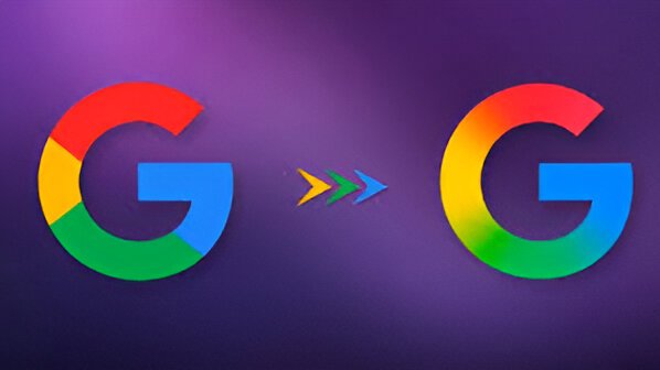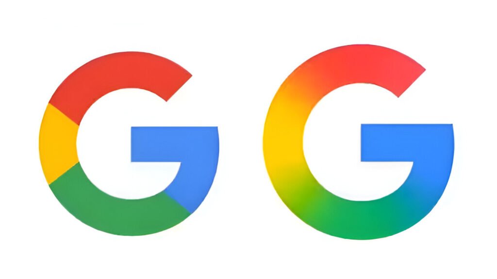
In a quiet but important gesture, Google has rolled out a new version of its iconic standalone ‘G’ logo in a subtle but important change, the first significant visual overhaul since 2015. The new icon replaces everyone’s familiar solid red, yellow, green, and blue blocks with a smooth gradient effect that merges the same colors into each other. The shift may appear subtle at first glance, especially on smaller devices, but it represents a deeper evolution of Google’s brand, consistent with its broader transition into the age of artificial intelligence.
A Decade Later, A Subtle But Significant Change
For years, the multicolored ‘G’ logo has been immediately recognizable as a mark that embodied Google’s fun yet forceful brand identity. The earlier version, launched in 2015 as part of a large-scale company-wide rebranding exercise, consisted of four flat color blocks. It was meant to embody Google’s simplicity and friendliness, yet still have a strong sense of identity across all its products and platforms.
Now, almost a decade on, the technology giant has rolled out an improved version of the same letter, this time enveloped in a flowing gradient. The new update is already rolling out to iOS users through the Google Search app and has been seen on Android devices using the beta version 16.18 of the Google app, specifically on Pixel phones.
On the surface, the new icon is not necessarily groundbreaking. But when placed into context within Google’s larger design language, particularly considering the release of Gemini, Google’s flagship generative AI assistant, just recently, it becomes apparent that this is significantly more than a skin-deep refresh.
The choice of a gradient look is not accidental. Google has been slowly redefining its visual identity to suit its increasingly serious emphasis on artificial intelligence. The introduction of Gemini earlier this year was a key moment in that process. Not only does Gemini mark Google’s most sophisticated AI product to date, but its own logo, a bright blue-to-purple gradient, is suggestive of an overarching design sensibility gestating inside the company.
Now that the ‘G’ logo has followed suit with a similar gradient approach, it seems that Gemini was an early indication of this broader transition. The change is consistent with Google’s attempts to create a more modern and forward-leaning brand image, one that keeps pace with the fluidity, innovation, and complexity of its AI-based products and services.
This is not just superficial rebranding for appearances. The gradient effect symbolizes the union of technologies, concepts, and services, a running theme in the age of generative AI, where lines between tools, platforms, and capabilities get increasingly seamless.

Why It Matters, Even If It’s Subtle
Branding refreshes at companies like Google never happen superficially or by accident. Even minimal adjustments can cause profound implications. By redesigning its ‘G’ symbol from a sharp-edged, rigid appearance to one that is newer and more curvaceous, Google is making a de facto declaration of readiness for a future in which clever assistants, computer algorithms, and personalized, AI-driven experiences prevail.
Additionally, the decision to deploy the new design selectively beginning with iOS and Pixel users is a testing ground for full-scale adoption. It also follows how technology firms tend to test user reaction before bringing sweeping visual overhauls to their ecosystem.
So far, the updated ‘G’ is still not on Google’s desktop versions or on non-Pixel Android devices. But the update is expected to roll out more in the future, perhaps sending the new look to more users.
What About Other Google App Logos?
To date, Google has not officially updated the logos of its other high-end products, including Gmail, Chrome, Drive, or Maps, which still feature their familiar solid-color icons. That being said, based on the gradient makeover of the ‘G’ logo, there may be changes ahead.
Given the extent to which AI has been woven into the fabric of virtually every Google product Smart Compose in Gmail to predictive navigation on Google Maps, it would not be surprising if soon other icons too start to exhibit this new visual direction. An across-apps gradient-based design language could assist in bringing user experience together as well as in highlighting the tech behind it.
A Visual Prelude to a Smarter Ecosystem
In its essence, the redesigned ‘G’ logo is as much an evolution of the past as a progression towards the future. It uses the same colors with which people have learned to identify Google but frames them in a sleeker, more contemporary way. Such understated progress reaffirms the consistent desire on the part of Google to revolutionize yet retain roots in that image that won it its popular following.
As AI becomes increasingly integrated into our everyday interactions, from search results to content creation, the manner in which companies visually present themselves is more important than ever. Design becomes a tool for storytelling, a means of conveying vision, innovation, and trust.
With the new ‘G’ logo, Google is literally telling a story of evolution, genius, and momentum. It’s a visual cue that the brand is maturing with the technology it preaches, opening the door to what is promising to be a bold new era in its existence.
In Conclusion:
Google’s new ‘G’ logo, currently being introduced on iOS and some Android devices, is more than an update to gradients. It’s an indication of the tech giant’s shift towards a unified, AI-driven ecosystem. With Gemini already showing similar design principles, this could be the beginning of something larger in the way of a visual refresh across Google’s products, bringing its branding in step with the future it is already building.


